NEW FORUM / SITE - User Tips

For feedback and suggestions about the SOS magazine, app, web site or forums.

Moderator: Moderators

Re: NEW FORUM / SITE - User Tips

Post by Forum Admin »

EvilDragon wrote:This is why I'm thinking there should be several options for width. Preferably one of them utilizing the full desktop width.

?? Full-width is impractical. Nobody realistically can follow along a line of text with their eyes that is 1024px long/wide -- that breaks every rule in the book.

And the right side column should be collapsible if the user wants it to (and this stored to a cookie).

We don't want you to collapse it. ;) It's a fundamental part of the site template and would affect articles and hide the adverts, and that would mean less funding for the site -- and like every magazine publisher, we can't afford to lose these revenue streams.

There's nothing stopping you moving the right side of the browser window leftwards towards the right edge of the forum text area if it really displeases you. And all modern browsers let you scale up/down any page, Cmd-+ on a Mac, not sure of PC, to get the whole site wider and fonts bigger if that helps?
User avatar
Forum Admin
Moderator
Posts: 4290 Joined: Mon Jul 21, 2003 11:00 pm Location: A studio deep in the fenlands of Cambridgeshire, UK
Search 16,966 SOS Reviews+Techniques articles: www.soundonsound.com/search
SOS Podcasts

Re: NEW FORUM / SITE - User Tips

Post by vinyl_junkie »

It's hoooorrrible and laggy. I don't get why it had to be re-done when it was ok.

Also the search function makes it difficult searching for old reviews. Google links also don't work now.
Example http://www.soundonsound.com/sos/jul02/a ... akaiz8.asp

Just like the new coke, it sucks so bring back the old coke and call it SOS Classic :lol:
Last edited by vinyl_junkie on Thu Jun 16, 2016 10:57 pm, edited 2 times in total.
vinyl_junkie
Frequent Poster
Posts: 1571 Joined: Tue Jun 24, 2003 12:00 am Location: Kent, UK

Re: NEW FORUM / SITE - User Tips

Post by Forum Admin »

vinyl_junkie wrote:It's hoooorrrible and laggy.

The tech guys are still working on optimising the servers and databases -- this is a massively complex site with a lot going on; the forum is a small part of it, but an important part.

I don't get why it had to be re-done when it was ok.

To bring it into the 21st Century and give us a tool that allows easier creation of web articles/news etc and administer it all wherever we might be internationally -- at trade shows, etc. If I told you how much work went into making a single article in the old site, you'd die laughing. This new CMS-driven site, with full eCommerce, integrated phpBB forum (one of the most popular packages in the world) is a real benefit to us, and the article presentation, tagging, searching etc is way, way better...

Also the search function makes it difficult searching for old reviews.

Not had any problems - can you be more specific?

Google links also don't work now.
Example http://www.soundonsound.com/sos/jul02/a ... akaiz8.asp

That article won't because it's not (yet) on the site -- currently August 2005 to June 2016 but Google links to articles from this period do work (they auto-redirect to the new site filename paths). The entire site is now SEO friendly, so we expect more traffic from Google.

The really early SOS mag articles which were never on the site anyway, as they were made with paper and glue layouts, pre-digital, have been lovingly scanned by forum member desmond and put onto his wonderful archives site: www.muzines.co.uk

We'll keep adding past issues as fast as we can, and new issues monthly.
User avatar
Forum Admin
Moderator
Posts: 4290 Joined: Mon Jul 21, 2003 11:00 pm Location: A studio deep in the fenlands of Cambridgeshire, UK
Search 16,966 SOS Reviews+Techniques articles: www.soundonsound.com/search
SOS Podcasts

Re: NEW FORUM / SITE - User Tips

Post by 4TrackMadman »

Ouch...this new layout is very tablet/phone friendly and PC unfriendly...it looks huuuuuuge.
User avatar
4TrackMadman
Frequent Poster
Posts: 1114 Joined: Wed Oct 30, 2002 12:00 am

Re: NEW FORUM / SITE - User Tips

Post by muzines »

Been having a nose around the other parts of the site (very generous putting the forum as the first item in the main nav - I'd have put "Magazine" there and shoved "Forum" off to the right end... ;) )

The new article display format is great, *sooo* much better and the various search/filtering stuff is really good - really good to have a bunch of different tools to suit different search/browse needs and it's working nicely. If anyone says that what was available before was better then I seriously question their judgement! :headbang:

It's all very readable, nice text sizes, and the boxouts and stuff work really well, and definitely imo improves the archive value of the content, particularly now SOS is much more mobile friendly. It's much more inviting to browse around on the sofa with a cup of tea (hmm, no "tea" smiley? Travesty!)

And, anyone that uses the forums and the site in general - please whitelist SOS in your ad blocker, should you use one. They're a responsible advertiser and it's a small and easy way to (at least) help give back for the benefit of the resource.
User avatar
muzines
Jedi Poster
Posts: 12202 Joined: Tue Jan 10, 2006 12:00 am
..............................mu:zines | music magazine archive | difficultAudio  | Legacy Logic Project Conversion

Re: NEW FORUM / SITE - User Tips

Post by Forum Admin »

desmond wrote:
And, anyone that uses the forums and the site in general - please whitelist SOS in your ad blocker, should you use one. They're a responsible advertiser and it's a small and easy way to (at least) help give back for the benefit of the resource.

Cheers desmond. I'm off to bed. :beamup:
User avatar
Forum Admin
Moderator
Posts: 4290 Joined: Mon Jul 21, 2003 11:00 pm Location: A studio deep in the fenlands of Cambridgeshire, UK
Search 16,966 SOS Reviews+Techniques articles: www.soundonsound.com/search
SOS Podcasts

Re: NEW FORUM / SITE - User Tips

Post by EvilDragon »

Forum Admin wrote:
EvilDragon wrote:This is why I'm thinking there should be several options for width. Preferably one of them utilizing the full desktop width.

?? Full-width is impractical. Nobody realistically can follow along a line of text with their eyes that is 1024px long/wide -- that breaks every rule in the book.

I can and do that all the time while on Reaper forums, KvR, Gearslutz, VI-Control. They all have full-width skin options and are GREAT for having that option. Different strokes for different folks.

Forum Admin wrote:We don't want you to collapse it. ;) It's a fundamental part of the site template and would affect articles and hide the adverts, and that would mean less funding for the site -- and like every magazine publisher, we can't afford to lose these revenue streams.

Ehh, an option would have been nice. Design could be so that ads are inlined between posts, not on the right hand side. In any case, I suppose nothing that a bit of Stylish scripting can't fix, if you won't...

Forum Admin wrote:There's nothing stopping you moving the right side of the browser window leftwards towards the right edge of the forum text area if it really displeases you. And all modern browsers let you scale up/down any page, Cmd-+ on a Mac, not sure of PC, to get the whole site wider and fonts bigger if that helps?

I don't need bigger fonts, I'm not blind. I like to see much WIDER posts - fitting more text horizontally so that less scrolling is necessary overall while reading a thread. Right now it's a bit ridiculous.
Last edited by EvilDragon on Fri Jun 17, 2016 10:48 am, edited 1 time in total.
User avatar
EvilDragon
New here
Posts: 11 Joined: Fri Oct 21, 2011 12:00 am Location: Croatia
 

Re: NEW FORUM / SITE - User Tips

Post by Hugh Robjohns »

EvilDragon wrote:I like to see much WIDER posts - fitting more text horizontally so that less scrolling is necessary overall while reading a thread. Right now it's a bit ridiculous.

The general wisdom in typography is that the most comfortable reading is with line lengths of 50-60 characters, with 75 characters as the maximum limit. This site is currently using about 65 characters per line as far as I can see, which feels very natural and easy to read to me.

Of course, everyone is different, has different preferences and copes or struggle with different things. A compromise is necessary and appropriate, and while it might be helpful to make the forum text boxes a little wider, but would probably be counter productive to go too wide.

H
User avatar
Hugh Robjohns
Moderator
Posts: 38957 Joined: Fri Jul 25, 2003 12:00 am Location: Worcestershire, UK
Technical Editor, Sound On Sound...
(But generally posting my own personal views and not necessarily those of SOS, the company or the magazine!)
In my world, things get less strange when I read the manual... 

Re: NEW FORUM / SITE - User Tips

Post by Pauly99 »

The new layout is very frustrating in the forum area. Approx 60-70% of screenspace wasted on my laptop, with a thin column of text that you have to scroll and scroll and scroll through. It's exhausting compared to the previous forum layout. Why can't you do dynamic resizing to suit the sreen size being used?
Pauly99
Poster
Posts: 21 Joined: Tue Nov 11, 2003 12:00 am

Re: NEW FORUM / SITE - User Tips

Post by forumuser838999 »

I can't see the readers ads at all. I'm used to seeing a link to them in the top level nav but it's not there, nor can I see it in the bottom nav. The old URL for readers ads now 404s.

Does this mean you've stopped doing readers ads??
forumuser838999
Posts: 3 Joined: Fri Jun 17, 2016 6:12 pm

Re: NEW FORUM / SITE - User Tips

Post by Hugh Robjohns »

forumuser838999 wrote:I can't see the readers ads at all. I'm used to seeing a link to them in the top level nav but it's not there, nor can I see it in the bottom nav. Does this mean you've stopped doing readers ads??

I don't know where you are -- it would be really helpful if you put a geo-location into your profile -- just the country would be enormous help to people answering your questions.

The reason I say that is because SOS has taken the policy decision to restrict Readers' Ads to the UK only -- they are no longer visible or accessible to anyone with an UP address outside the UK.

If you are inside the UK, then you'll find the links to Readers' Ads half way down in the right hand side bar.

H
User avatar
Hugh Robjohns
Moderator
Posts: 38957 Joined: Fri Jul 25, 2003 12:00 am Location: Worcestershire, UK
Technical Editor, Sound On Sound...
(But generally posting my own personal views and not necessarily those of SOS, the company or the magazine!)
In my world, things get less strange when I read the manual... 

Re: NEW FORUM / SITE - User Tips

Post by Hugh Robjohns »

Pauly99 wrote:The new layout is very frustrating in the forum area. Approx 60-70% of screenspace wasted on my laptop, with a thin column of text that you have to scroll and scroll and scroll through. It's exhausting compared to the previous forum layout. Why can't you do dynamic resizing to suit the sreen size being used?

The overall website width is identical to that of other major players, like the BBC's news website. It has a fixed size in desktop/laptop screens the same as other major websites.

The dimensions of the main column and side bar are consistent across the whole site for many and varied reasons, so the forum has to live within this space because -- unlike the previous incarnation -- it is a fully integrated part of the site in every way.

There is no fundamental need to 'scroll and scroll and scroll' -- I humbly suggests you're doing that because you haven't yet found the many quick and direct access methods that are built into the Forum software.

For example, there are red links at the top of a forum thread page to take you to the most recent addition. You can also directly access the latest posts by using the links half way down the right hand side bar. And clicking on the chevron to the right of a poster's name takes you straight to their post too.

I'm sure you'll find -- as we all have -- that navigating this new forum system is actually very quick and easy once you're familiar with its new ways. ;)

H
User avatar
Hugh Robjohns
Moderator
Posts: 38957 Joined: Fri Jul 25, 2003 12:00 am Location: Worcestershire, UK
Technical Editor, Sound On Sound...
(But generally posting my own personal views and not necessarily those of SOS, the company or the magazine!)
In my world, things get less strange when I read the manual... 

Re: NEW FORUM / SITE - User Tips

Post by Hugh Robjohns »

EvilDragon wrote:I can and do that all the time while on Reaper forums, KvR, Gearslutz, VI-Control. They all have full-width skin options and are GREAT for having that option. Different strokes for different folks.

Maybe, but none of those are operating a forum as a fully integrated element of a magazine website. The situation and the requirements from the SOS end are completely different.

Ehh, an option would have been nice. Design could be so that ads are inlined between posts, not on the right hand side. In any case, I suppose nothing that a bit of Stylish scripting can't fix, if you won't...

Go for it. The site is laid out the way it is for clearly defined reasons and the side bar is not an optional extra, it an important part of the design.

I like to see much WIDER posts - fitting more text horizontally so that less scrolling is necessary overall while reading a thread. Right now it's a bit ridiculous.

I appreciate your view... but I don't share it. It feels very comfortable to me, and I dare say I spend a lot more time on this forum than almost anyone else! ;)

H
User avatar
Hugh Robjohns
Moderator
Posts: 38957 Joined: Fri Jul 25, 2003 12:00 am Location: Worcestershire, UK
Technical Editor, Sound On Sound...
(But generally posting my own personal views and not necessarily those of SOS, the company or the magazine!)
In my world, things get less strange when I read the manual... 

Readers' Ads

Post by Forum Admin »

forumuser838999 wrote:I can't see the readers ads at all. I'm used to seeing a link to them in the top level nav but it's not there, nor can I see it in the bottom nav. The old URL for readers ads now 404s.

Does this mean you've stopped doing readers ads??

The 404s might have been a glitch as servers propagated the domain switchover. It's certainly working for me.

The new site design has been heavily influenced by detailed analysis of which sectors of the site attract the most traffic, and readers' ads -- whilst popular and an essential service for many who the stats tell us come here, post their gear/wanted ads and go nowhere else, have no subscription, etc (but yes, they could be newsagent print mag buyers) -- it is not used by the majority of our 1.1 million unique monthly site visitors.

So design decisions were made to move it out of the main navigation options, to allow greater/easier emphasis on the sections of the site that were previously hidden under the 'Articles' menu. Again, the stats tell us that a huge amount of incoming traffic comes to these articles every month/week/day from the search engine article links that their bots/web crawlers index. Hence why you can now see the section menu links in bold black below the horizontal banner ad above.

And because those same stats revealed that very few of our US brethren, Europeans, Australians, Japanese etc ever read or posted an advert in Readers' Ads, we have Geo-IP targeted that section to the UK-only (it might get extended to include other regions later).

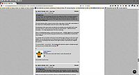
So we created 3 bright red buttons to make them stand out, and slotted them between the adverts on the righthand side of every SOS site page. And we set about improving the functionality and user management of your ads (via MY ADS, once you have submitted an advert) -- and there are plans for extras in the future, as the site develops.

You are UK-base, so should be able to see them. The screenshot should help you find them (click for a larger view).
Screen Shot 2016-06-17 at 19.07.47.png
Last edited by Forum Admin on Fri Jun 17, 2016 7:30 pm, edited 1 time in total.
User avatar
Forum Admin
Moderator
Posts: 4290 Joined: Mon Jul 21, 2003 11:00 pm Location: A studio deep in the fenlands of Cambridgeshire, UK
Search 16,966 SOS Reviews+Techniques articles: www.soundonsound.com/search
SOS Podcasts

Re: NEW FORUM / SITE - User Tips

Post by Pauly99 »

Hugh Robjohns wrote:
Pauly99 wrote:The new layout is very frustrating in the forum area. Approx 60-70% of screenspace wasted on my laptop, with a thin column of text that you have to scroll and scroll and scroll through. It's exhausting compared to the previous forum layout. Why can't you do dynamic resizing to suit the sreen size being used?

The overall website width is identical to that of other major players, like the BBC's news website. It has a fixed size in desktop/laptop screens the same as other major websites.

The dimensions of the main column and side bar are consistent across the whole site for many and varied reasons, so the forum has to live within this space because -- unlike the previous incarnation -- it is a fully integrated part of the site in every way.

There is no fundamental need to 'scroll and scroll and scroll' -- I humbly suggests you're doing that because you haven't yet found the many quick and direct access methods that are built into the Forum software.

For example, there are red links at the top of a forum thread page to take you to the most recent addition. You can also directly access the latest posts by using the links half way down the right hand side bar. And clicking on the chevron to the right of a poster's name takes you straight to their post too.

I'm sure you'll find -- as we all have -- that navigating this new forum system is actually very quick and easy once you're familiar with its new ways. ;)

H


This is a screenimage of what it looks like on my PC. As you can see, mostly empty space.

Image

You mention the BBC site as being similar, and I agree: that is one of the worst laid out sites of all the 'news' style websites, with huge amounts of wasted space.
Pauly99
Poster
Posts: 21 Joined: Tue Nov 11, 2003 12:00 am

Re: NEW FORUM / SITE - User Tips

Post by Hugh Robjohns »

Pauly99 wrote:This is a screenimage of what it looks like on my PC. As you can see, mostly empty space.

Ah yes... but what is there is beautifully crafted... :lol:

Seriously, though, it is what it is for good reasons. The forum is an integral part of the entire website now, rather than an entirely standalone entity as it was previously, and so it now shares the same style and sizing, (and -- importantly -- mobile-friendliness) as the rest of the site.

Moreover, the forum text window is around 100 characters wide which is already on the long side of the optimum for readability. There are no plans to make it any wider.

H
User avatar
Hugh Robjohns
Moderator
Posts: 38957 Joined: Fri Jul 25, 2003 12:00 am Location: Worcestershire, UK
Technical Editor, Sound On Sound...
(But generally posting my own personal views and not necessarily those of SOS, the company or the magazine!)
In my world, things get less strange when I read the manual... 

Where is Readers' Ads?

Post by Forum Admin »

forumuser838999 wrote:I can't see the readers ads at all. I'm used to seeing a link to them in the top level nav but it's not there, nor can I see it in the bottom nav. The old URL for readers ads now 404s.

Does this mean you've stopped doing readers ads??

No, we never stopped doing them, initially we just kept them as UK-only for around 9 days whilst we completed Geo-IP functionality. The old URL maps to the View All Ads page here, try it: http://www.soundonsound.com/readersads Everyone globally can once again access/view/use Readers' Ads if they wish.
Screen Shot 2016-06-25 at 09.36.13.png
The access points now are 2/3 red buttons on the right column below the tall skyscraper banner ad. When on the actual R/Ads pages, these buttons move up and the categories/search is below.

You're right -- at the moment there is no Readers' Ads link in the black footer at the very bottom of every web page-- this will be restored on Monday.
User avatar
Forum Admin
Moderator
Posts: 4290 Joined: Mon Jul 21, 2003 11:00 pm Location: A studio deep in the fenlands of Cambridgeshire, UK
Search 16,966 SOS Reviews+Techniques articles: www.soundonsound.com/search
SOS Podcasts

Re: NEW FORUM / SITE - User Tips

Post by Guest »

How do you delete a post? I just posted something then realised the thread was 7 years old. I click on edit but I can't see a delete button.
Last edited by Guest on Thu Jun 30, 2016 6:21 am, edited 1 time in total.
User avatar
Guest

Re: NEW FORUM / SITE - User Tips

Post by Tim Gillett »

Pre the change, in posting there was an option of pressing "Reply" and the username of the person you were replying to appeared at the top of the new post. Now that option no longer exists.

Not hard to work with that new limitation, but now on all threads prior to the change, where the "Reply" option was used, the username of the person being replied to no longer appears. We cant tell who was being replied to. Makes it harder to understand the reason for such posts.

Tim
Tim Gillett
Frequent Poster
Posts: 2632 Joined: Wed Jan 30, 2013 12:00 am Location: Perth, Western Australia

Re: NEW FORUM / SITE - User Tips

Post by Forum Admin »

Salty Dog wrote:How do you delete a post? I just posted something then realised the thread was 7 years old. I click on edit but I can't see a delete button.

There was no Delete function on the old forum... you currently will need to Report the topic using the button in the icons by the topic/post title (it's the circular one with ! exclamation mark in it; hovering over shows you a tool-tip).

Give your reason and one of the Mods will delete it for you.
User avatar
Forum Admin
Moderator
Posts: 4290 Joined: Mon Jul 21, 2003 11:00 pm Location: A studio deep in the fenlands of Cambridgeshire, UK
Search 16,966 SOS Reviews+Techniques articles: www.soundonsound.com/search
SOS Podcasts
Post Reply